Friday, April 26, 2019

#TGIF209 Seeing Sepia Spots

I'm not tooting my own horn here, but I am highly encouraging you to try out this week's challenge at TGIF.  #TGIF209 is seriously super fun!  It's all about "playing with sepia tones."  Who would have thought that an all brown color palette would be invigorating?  I mean let's be real here, is brown the first color you pull out when stamping?


It seemed fitting to add a filter to today's photos to enhance the vintage feel to the monochromatic theme.  This way everybody can view my Needle & Thread card while "seeing sepia spots."

While I did add a filter there is not much difference from the original photo.  My colors include Sahara Sand, Crumb Cake, Soft Suede, Early Espresso, and Very Vanilla.  A piece of ivory lace and a scrap of burlap were perfect additions to enhance the sepia challenge and my vintage spin.


I started with a Thick Very Vanilla top fold card base.  To that I added a Crumb Cake panel that I ran through the Tin Tile Embossing Folder.  I lightly sponged the edges and raised portions of the Crumb Cake piece and then layered it on Early Espresso.  A flag cut from the Share What You Love DSP anchors all the focal decor.  I also sponged the edges of this piece to enhance the distressed vintage feel of the card.   Under the pattern paper is a strip of the Lace Trim.


I used the Needle & Thread Stamp Set with the Needlepoint Elements Dies for all the flowers, leaves, and the label.  The one thing I really like is the "friend" sentiment.  First I sponged a scrap of Silver Glimmer Paper with Early Espresso Ink and then I cut it out with the Well Written Thinlits.  The trick is to sponge first then cut.

Thursday, April 25, 2019

Fancy Friday is For Family


It may not be the most obvious choice, but I chose to pair the Love You to Pieces and Rooted in Nature Stamp Sets for a family themed blog hop.  Keep scrolling and reading and I let you know my thought process.


This month's Fancy Friday theme is to create a project of our choice for any family member! It could be a birthday card for sister or brother, a Mother's Day card, Father's Day, Graduation, or whatever fits our family's event calendar.  On my calendar was the need for an anniversary card for...


...my own 30th wedding anniversary!  That's right, Newel and I celebrated 30 years on April 5th.  I think the sentiment inside the card says it all.  We do fit!  We like the same spicy foods, style of eclectic home decor, genres of movies and music, places to vacation, series to binge and lots more.

I quite like how the puzzle piece shapes juxtapose with the leaves and woodgrain.  Knowing how to mix shapes or patterns is all about taking risks.  Sometimes it works and other takes end in the garbage can.  I love mixing major opposites like chicken and waffles or Diet Coke with caviar.  The same it true with paper crafting elements.


So, now you know why I picked the Love You to Pieces Stamp Set.  Now let me tell you why I chose the Rooted in Nature set.  It's really quite simple, it's because the imagery in the set and even the Pinewood Planks Embossing Folder makes me think of my family tree.  All those bountiful branches who came before me and those sprouting now who will carry on our family names and traditions.


Who is next in your family to receive a hand stamped card from you?  Let's go check out what Dani is making and who she is sending it to.  #makeacardsedacard


Product List
Rooted in Nature Stamp Set | Nature's Roots Framelits | Nature"s Poem DSP
Love You to Pieces Stamp Set | Puzzle Pieces Framelits
Blushing Bride, Whisper White, Bermuda Bay, Old Olive, Pool Party, & Petal Pink Cardstocks
Early Espresso, Grey Granite, Old Olive, & Tranquil Tide Ink Pads 
Pinewood Planks TIEF | Frosted Flower Embellishments Basic Pearls | Braided Linen Trim
Stampin' Dimensionals | Fine Tip Glue


Tuesday, April 23, 2019

HSS #313


Big blooming florals, gold die cut sentiments, and a color palette of rose pink, soft blue, and crisp white are the bits of inspiration that motivated me to create this lovely card for our challenge at Hand Stamped Sentiments.


Sunday, April 21, 2019

Climbing Orchid Take Two & Three


Greetings and welcome to my blog SeeingINKspots and our Monday Montage Blog Hop.  For this hop I am sharing with you a card that I made for a shoebox swap and another similar version we made in my Technique Time! stamp class this month.  Here's the back story though, these cards are cases of a card I made a while back.  I really enjoyed the my first layout/card so I made it again in a completely new and bright color combo of bright yellow and aqua.


This first card, the shoebox swap, features a 3" x 4" panel of Daffodil Delight Gingham Gala DSP to show off the white Phalaenopsis orchids made with the Climbing Orchid Stamp Set and Dies.  Both cards also include a Dazzling Diamonds Glimmer Paper die cut.  These pieces were cut with a die from the Swirls and Scribbles Dies.

For my third variation on this card I used a Crushed Curry piece of the Classic Garage DSP.  It might be tricky to see in the photo, but I did stamp the DSP with Whisper White Ink and the Buffalo Check Background Stamp.

I also add a powerful sentiment to the inside of this third version of my card.  I wanted to share the Strong and Beautiful Stamp Set with those attending my class.  This set is found in the Occasions Catalog and may be a bit overlooked.  The sentiments in the set are just what the name of the set says they are--strong and beautiful.


Next up in today's blog hop is Melissa Stout.  Or, if you like to click backwards you will be visiting with Dani Dziama.  Enjoy the hop and happy stampin'.
to Dani
to Melissa
Monday Montage Hoppers

Friday, April 12, 2019

#TGIF207 A Sketch with a Flourish

This is a totally cool sketch designed by #TGIF and it's for anybody wanting to play along with our challenge this week.  There are so many directions you could take this layout, but right off the bat I knew what I wanted to do.


I knew I wanted to copy the floral portion of the sketch by using the largest die from the Flourish Thinlits Dies.  I cut the die from Black Foil Paper and it gave it major fits!  I did not want to come out of the die but with a bit of patience I finally got the entire piece free from the metal.  Once I had my focal point I tried different papers and landed with the Tropical Chic DSP to develop the balance of the sketch.


The blush panel and the two greeting layers were cut with the Rectangle Stitched Framelits.   If you look close you will see I used the Subtle TIEF to add a little texture.  For the sentiments I used images from the Rooted in Nature Stamp Set.

Sunday, April 7, 2019

Monday Montage Casing Myself


I cased a quick and fun card of my own!  I made two more variations using the same layout, stamps, and ribbon.  I just changed up the pattern papers and ink colors to fit the season.


Here is the card I cased and following are my simple switches to rework a little something for Easter and to get a jump start on Christmas.  All still featuring the More Than Words Stamp Set.


For this card I used one of my favorite pieces from the Abstract Impressions DSP and layered it on a Blushing Bride card base.  My ink colors are Blueberry Bushel, Blushing Bride, and Melon Mambo.


My Christmas card is made with Crumb Cake, Shaded Spruce, and Merry Merlot.  The die cuts tucked behind the sentiment were cut using the Pretty Pines Thinlits.  Just like the original card I added a piece of Braided Linen Trim that I pulled apart to make it a bit shaggy.


It was fun to have you stop by to check out my Monday Montage post.  Next up is the delightful Julie Warnick.  Have a great time and lots of happy stamping.'

to Cheryl
to Julie

Monday Montage Hoppers

Gingham Style


"Hey stamper lady, Creation Station's gingham style!"

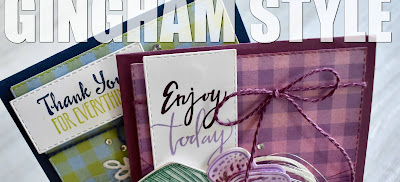
This month's hop is all about gingham and going crazy with it.  For this themed topic I chose to alter a couple sheets of the Gingham Gala DSP to make my own stylized pieces of custom dsp.


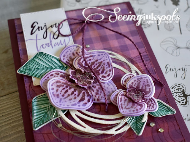
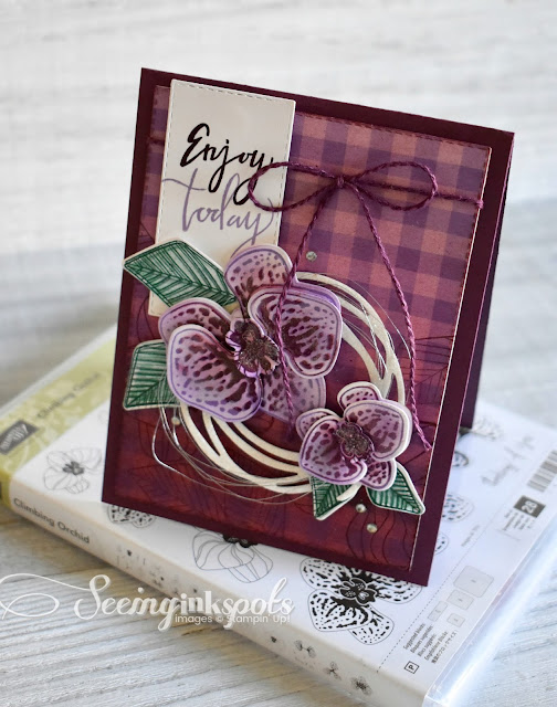
Featured on the first gingham styled card is the Climbing Orchid Stamp Set and matching framelit dies.  I started with a piece of the Highland Heather Gingham Gala DSP and then sponge brayered it with a light cover of Berry Burst and Fresh Fig Ink.  I gradually inked heavier at the bottom of the piece for an ombre look.  Not only did I brayer ink on the DSP, but I also stamped the lower half of the paper with a couple images from the stamp set using Fresh Fig ink.


The fun part of making this card was creating the two orchids.  I put my Stamparatus to work to add a variety of ink colors to the orchid petal images.  I used Highland Heather first, then Berry Burst and Rich Razzleberry, and last Fresh Fig and Blackberry Bliss.


For the leaves I stamped in Shaded Spruce and then used an Aqua Painter to smear the ink just a bit.  Then I stamped again and again to intentionally blur the look to add some visual depth.  Each leaf has a gentle fold down the center to enhance the dimension.  Finishing details include loops and loops of Silver Metallic Thread, Basic Rhinestones, and Dazzling Diamonds Glitter.


My second card features all the same design concepts, layout, and use of the Rectangle Stitched Framelits.  I just switched up the colors, stamps, and dies.  It may be tricky to tell but this gingham print is the Lemon Lime Twist color.  I sponged this piece with Balmy Blue and Night of Navy.


The images from the Petal Palette Stamp Set were colored using a mix of Stampin' Blends.  Where I had to get clever was mixing some green blends with yellows to get as close to lemon lime as I could.


I do love the Medium Night of Navy Baker's Twine.  It has such a great weight and look.  And, it is super easy to tie.  Like my first card I added some loops of thread and touches of rhinestones.


Gingham adds such a light hearted almost reminiscent flair to your hand made creations.  I wonder what bright, fun and lovely projects Kerstin Kreuzer has been up to as she designed with gingham patterns.  It's time to go see what gingham style is for today.